By Cynthia Unninayar
In the Trends & Colours Winter issue, our annual trends tracker guide, we talked about the top twelve trends in fine
jewellery for 2010. Since colour is one of the major trends, we also included comments from fashion designers on
the use and importance of colour. In our Trends & Colours Spring issue, we continued the colour story for
Spring/Summer 2010. In the present issue, we offer a preview of the fashion colour scene for Fall 2010, as depicted in
Pantone’s Fashion Colour Report Fall 2010.
“Building on the color palette from spring, this season’s offerings include
innovative takes on fundamental basics, as well as transporting lively colors that conjure images of travel and adventure,
whether real or aspirational,” explains Leatrice Eiseman, executive director of the Pantone Color Institute®. And, of
course, we offer examples of fashionable and colourful fine jewellery to go along with these ten basic colours.
| Nikki Seacca, Mathon Paris |
| Peter Som, using Pantone’s
Woodbine: Fashion and color
are a pick-me-up. It’s time
for happy clothes. |
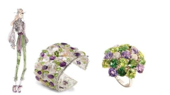
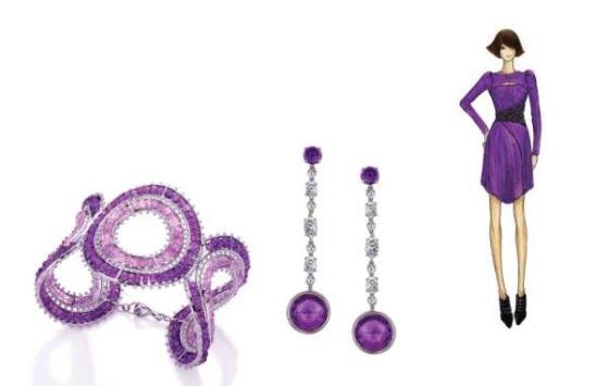
| Yigal Azrouël, using Pantone’s
Purple Orchid: It hasn’t
really changed but has
reinforced that what we
design has to be special
and individual. New rule?
Don’t be afraid to try it. |
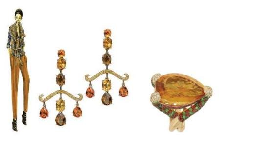
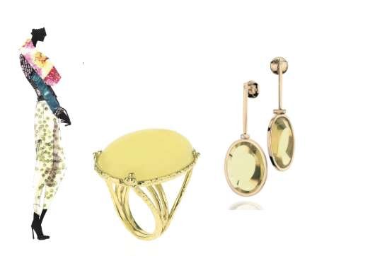
| Elie Tahari, using Pantone’s
Golden Glow: There are
really no specific
rules for colours, it
just depends what
colours work best
with a specific fabric
or yarn. |
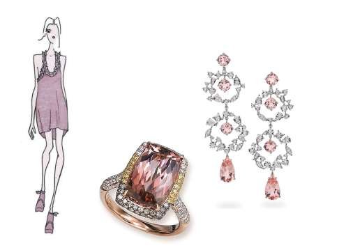
| Jolie B. Ray Designs, Yael Sonia |
| Rachel Roy, using Pantone’s Endive:
I am continuing to design for
the modern, classic woman
and always think of her when
choosing colours. Of course, we
are conscious of the economic
conditions but that does not
deter us from continuing to put
out luxurious, beautiful clothing.
My new fashion color rule for
2010? Have fun with colour,
always! |
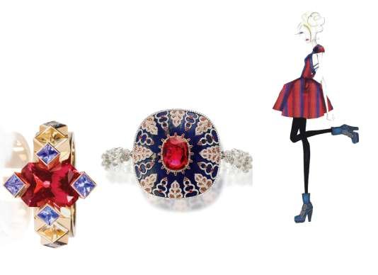
| Nanette Lepore, using Pantone’s Lipstick Red:
In current economic conditions colour
is more important than ever. Incorporating
a few fresh colours into your
wardrobe can revitalize and provide
an array of potential new colour
combinations to make getting dressed
more exciting. |
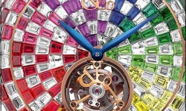
| Alfieri & St John, Giovanni Ferraris |
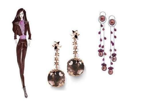
| Baby Phat by Kimora Lee Simmons, using Pantone’s
Chocolate Truffle: Taking into consideration the
current challenges facing today’s economy,
I hope to inspire customers by offering
vibrant colour hues that translate through
time. |
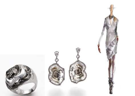
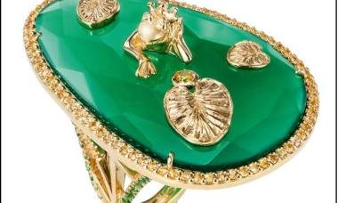
| Tamir Jewels, Mathon Paris |
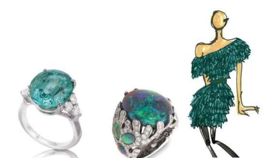
| Tadashi Shoji, using Pantone’s Lagoon:
I tried to keep in mind that customers
are buying more for longevity these
days, so I didn’t choose colours that
would go out of favour after one
season. Also, I really tried to stay
away from Black as I wanted to offer
women some hints of fun and colour. |
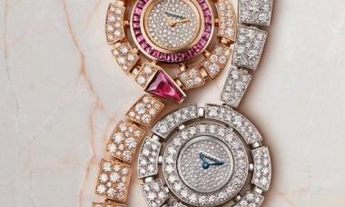
| Tiffany & Co, Vianna Brasil |
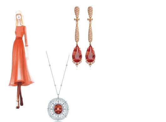
| Erin Fetherston, using Pantone’s Living Coral:
Colour is more important than ever.
Colour is an expression of mood
and emotion. I use colour to inspire
and create positivity. |
| VPL by Victoria Bartlett, using Pantone’s Oyster
Gray: It drives you to be more creative.
I like the idea of serenity and lustre
that is subdued. I don’t like to abide
by rules—it comes from the heart, but
this collection is about tranquillity and
calm. |
| Rebecca Taylor, using Pantone’s
Rose Dust: The colour palette
is more restrained to fit the
need of the contemporary
girl. New neutrals emerge
with a touch of bright. |